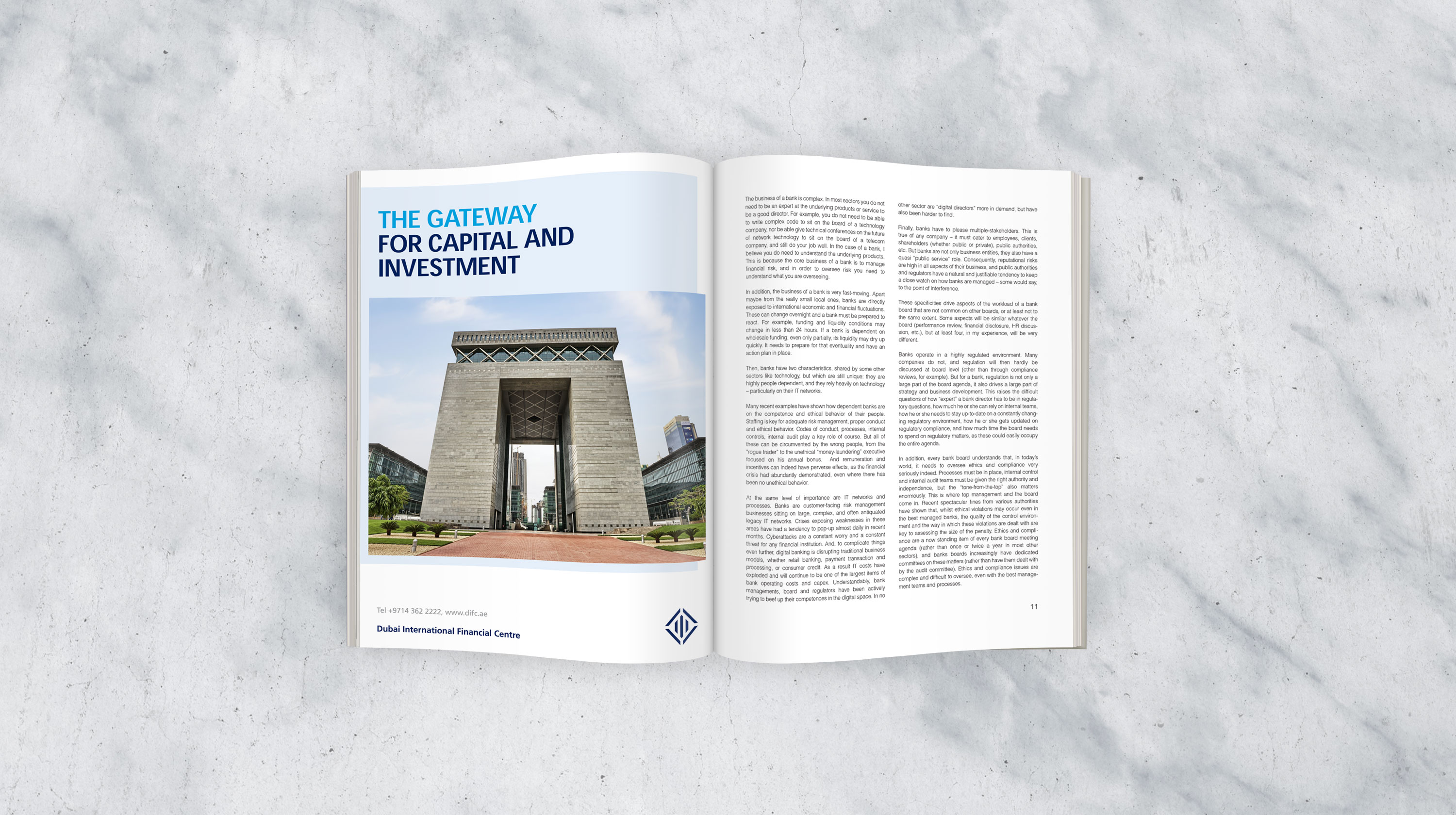
DIFC is a global financial centre strategically located between the East and West, providing a stable and secure platform for businesses and financial institutions to tap into the emerging markets of the Middle East, Africa and South Asia. The Centre’s internationally recognised and independent regulation, common law framework, tax-friendly regime, and enabling environment make the ideal hub to access the region’s rapidly growing demand for financial and business services.
I had the opportunity to work with DIFC marketing team on revitalising the brand identity. After conducting brand audit for the communication materials, we agreed on areas we need to address, in order to bring tangible improvements and achieve objectives. At the time, the DIFC identity had too many lockup variations, no consistent design practices, and outdated look and feel.
We suggested to minimise the variations of the identity to the minimum, consolidating the visual system by defined and structured design practices, and enhancing the overall brand identity with subtle yet contemporary design elements.
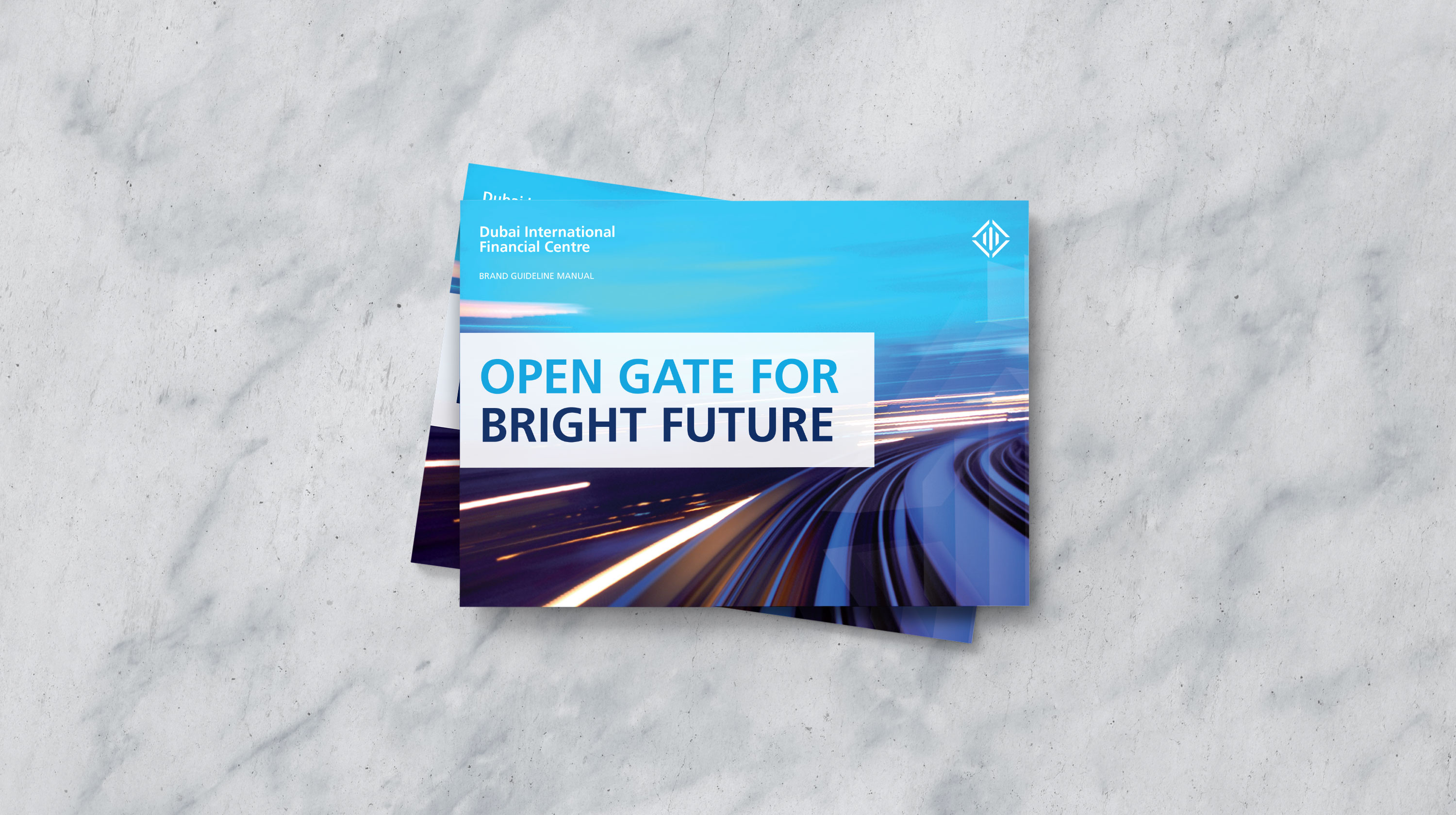
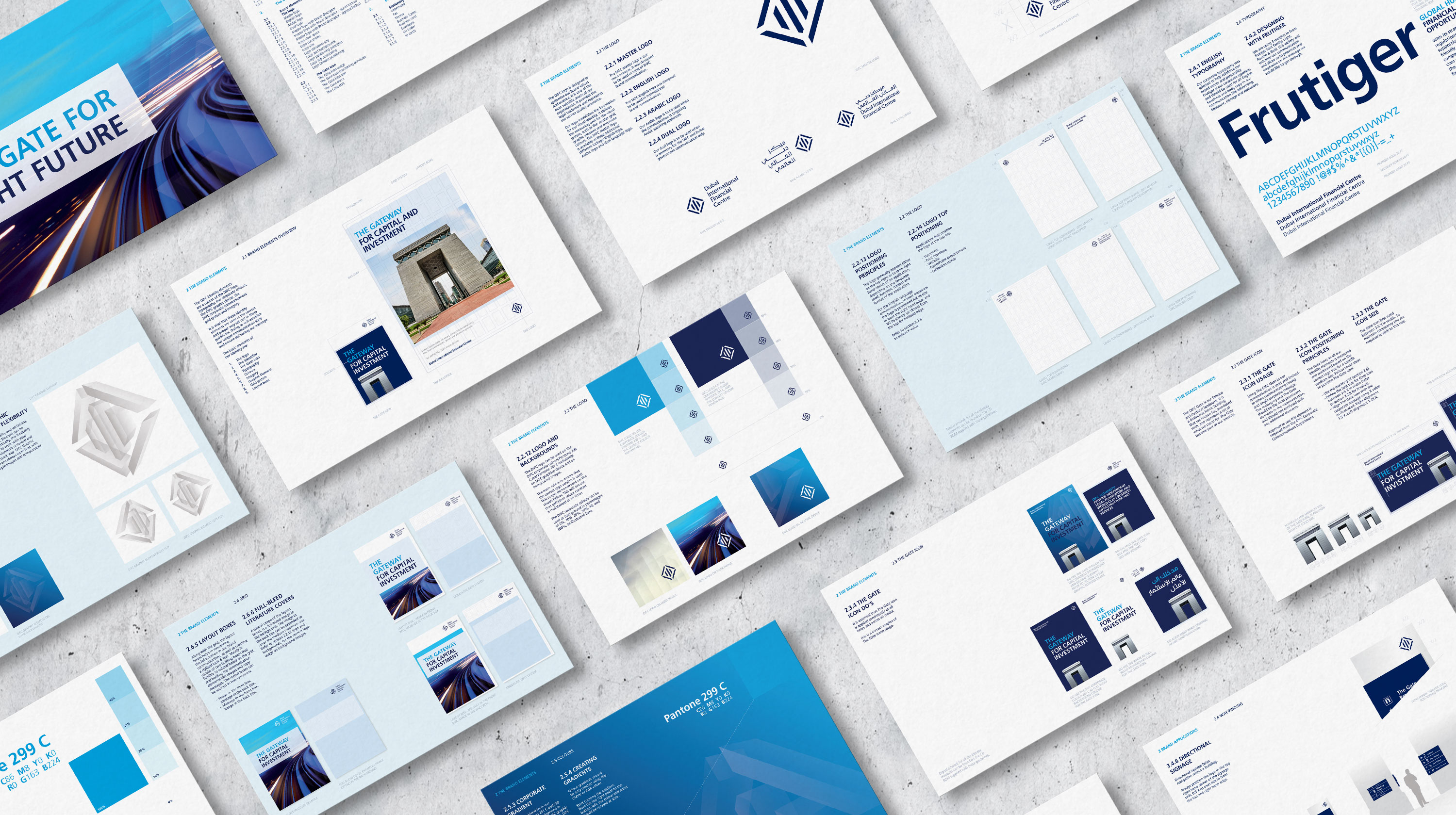
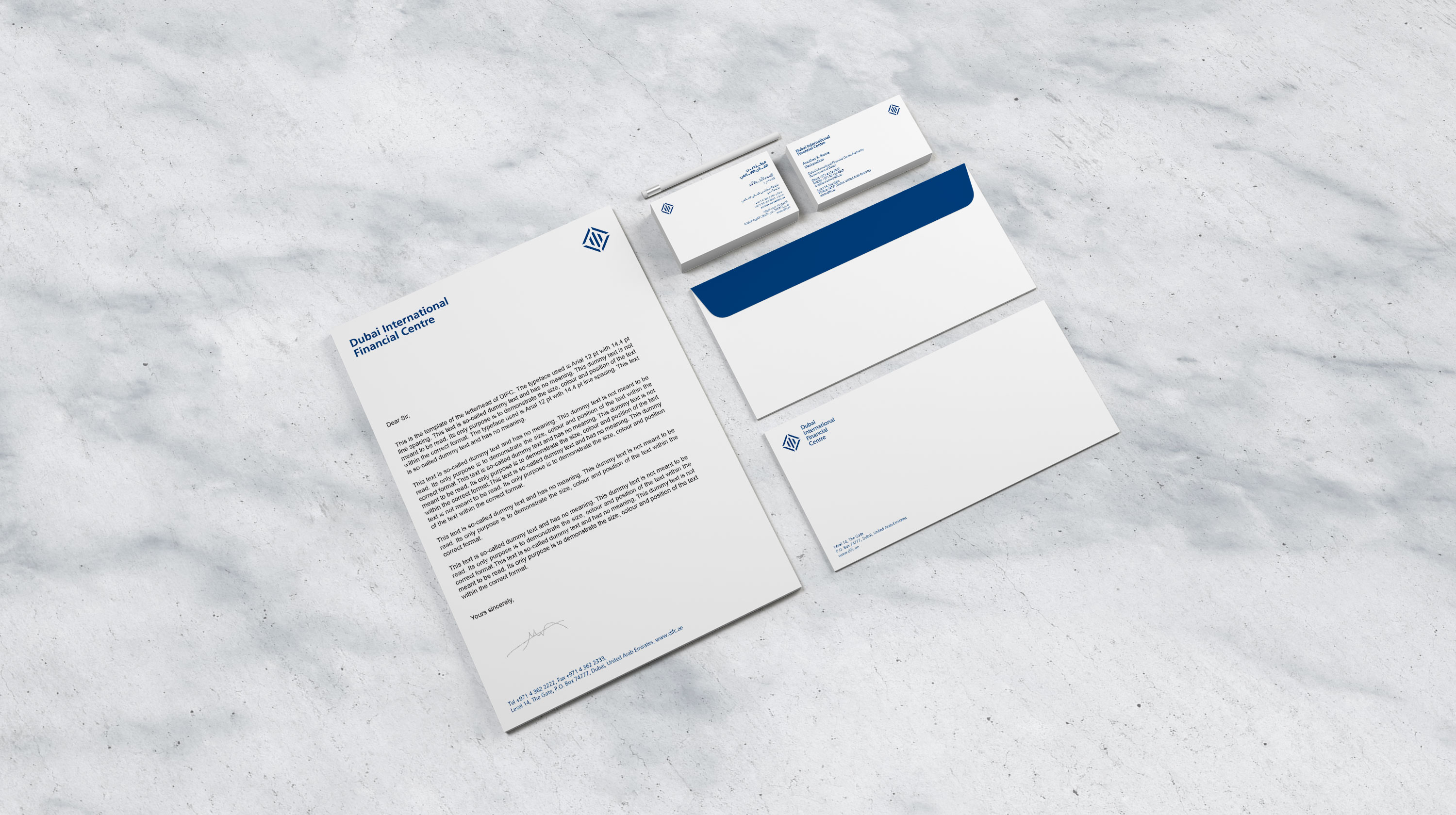
Moving forward with the new recommended visual system, we created the new brand identity guideline that brings consistency principles to implementation. Also, we produced the most essential communication materials like corporate applications, events communication, the Annual Review, and promotional brochures.
Project
Brand Identity System
Client
What I did
Brand Audit / Brand Marque Design / Brand Visual System / Advertising System / Literature System / Corporate Applications / Merchandising / Brand Identity Guideline / Brand Identity Digital Assets
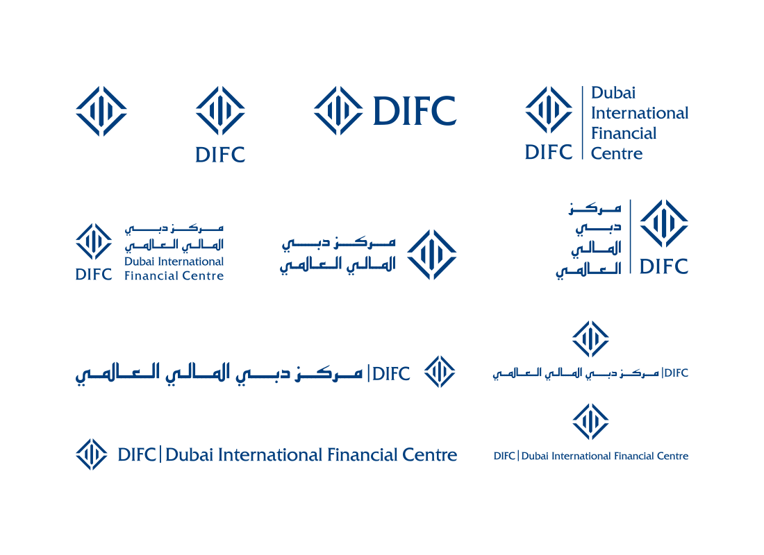
Variation Issue
Too Many Lockups!
Having too many variations of the identity created confusion and inconsistent implementation. Initially, the DIFC full name, the name abbreviation and the need to use two languages created this number of lockups.
Apply Focus
Simplifying the Identity
By reducing the identity to the most essential lockups, the application of the brand became more focused and consistent. We seized the opportunity to update the design of the Arabic typography to match the style of the English design.

Well-Structured Platform Solution

1
Full image communication style
2
Framed image communication style
3
Inner frame element
4
Large headlines
5
Offering is structured based on master grid system
6
The DIFC full name
7
The DIFC brand marque positioning
The new communication design system enabled versatile yet consistent application across all the DIFC brand communication touchpoints. The design enabled the use of full images, framed images, coloured background, large headlines, and enabled Left-To-Right and Right-To-Left direction language systems.
Introducing a new brand element to enhance the overall communication style!
The solution applied to brand application


Branding principles put into practice through guideline